Creativity Days

Creativity Days

Creativity Days featuring great design, architecture, fashion, graphics and innovation from across the globe.


Moscow Ambassadors School

Interesting stories are hidden behind every turn of the old streets and it is impossible to associate the City with any one minimal set of recognizable symbols. While studying the city, the future ambassador discovers it anew, like a student discovers a primer at school. For the construction of the identity, a typographic solution was chosen, based on the principle of typographic eclecticism: the Old National script, interspersed with the cursive script and recognizable fonts of the avant-garde artists. The color scheme is laconic-bright red.

Continue reading


Q Shinsyu Apple Pie Lab

These are branding projects for Q, an apple pie specialty store. The typography of the store's name, Q, was created using the apple as a motif and symbol for the store. All brand tools, including the exterior, interior, lighting, stools, uniforms, and packaging, were designed using this simple symbol. In keeping with the product concept of utilizing materials as they are, the tools are also designed simply, utilizing the colors and textures of the materials, such as paper and wood, as they are. All designs are in line with the store's vision of valuing the original taste of apples.

Continue reading


The River Runs Through

The River Runs Through is a dynamic art installation which explores the rich narrative of the water ways found at the Merbein Common; a native reserve on the Murray River of Victoria. The artwork combines traditional mural painting with innovative digital printing and is presented on the walls of an old refrigerated storage shed, which was once used to store fruit for a juice factory. At night it is a totally different experience; powered by the sun the artwork is transformed into a colorful light installation.

Continue reading


OCT Happy Hour

Corbusier architectural language is well extracted and expressed in the wayfinding-sign design in this project. In general, the whole rough bold appearance is featured by exaggerated crude concrete components and exposed unfinished structures and facilities; in detail, cool shadows of heavy metal materials produce artistic 3D visual effects, conveying a powerful sense of minimalism.

Continue reading


Cloud Mountain Type

The Cloud Mountain Type inspired by Zhang Jiajie, the Chinese cloud-fog mountains and ancient Chinese landscape painting. Combined the traditional Chinese clouds landscape with western character. The Chinese saying: “ You cannot recognize the shape of a mountain when you stand on it.” When you stare at the details of the font, you even can’t recognize the letter itself, that is because you have already stand on the cloud-fog mountains.

Continue reading


Zaku inc.

This symbol has two meanings. It is the company name and the company slogan. It consists of typography of Japanese kanji characters, which read zaku in the company name. The kanji also contains the meaning of to create. The silhouette of Good's hand is formed using this character, which means to create. In this way, the company's slogan of Creating Good is expressed in a single mark. The symbol mark expresses the company's commitment to creating Good in the world through creative measures.

Continue reading


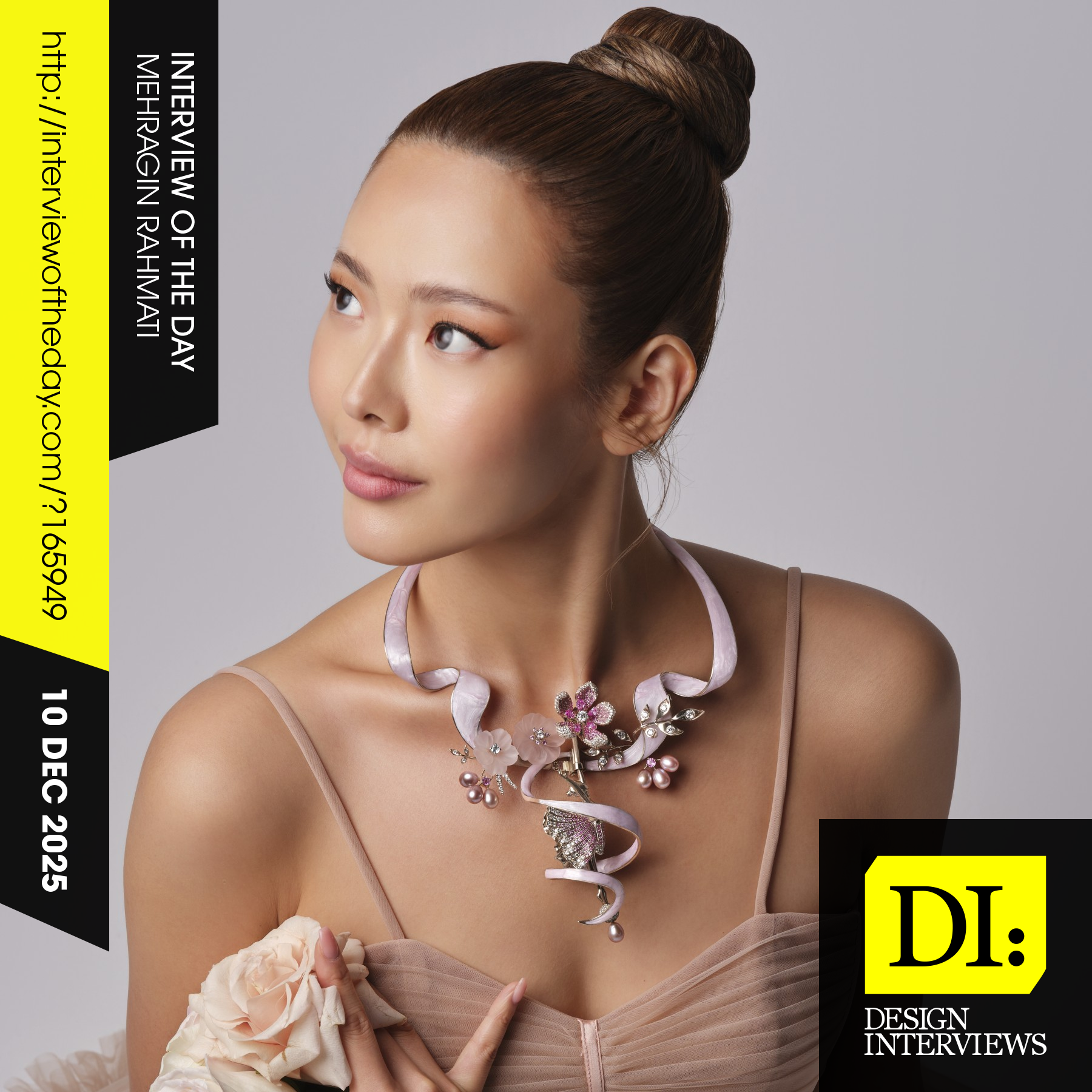
Design interview of the day

Read the latest interviews and conversations on design, creativity and innovation between design journalist and world-famous designers, artists and architects. See latest design projects and award-winning designs by famous designers, artists, architects and innovators. Discover new insights on creativity, innovation, arts, design and architecture. Learn about design processes of great designers.

Continue reading